-
Getting Started
-
Wearable
- Garmin Device Firmware Guide
- Check Garmin Device Firmware
- Set up and Connect Garmin Index2 Scale
- Screen Control on Garmin Wearables
- How to charge Garmin devices best
- Wearable and Device ID Management
- Setup: Prepare Wearable Devices
- Compatible Garmin Devices
- Garmin Timezone & Time
- Wifi Capabilities and Restrictions of Garmin Devices
- Screenless bands for blinded data collection
-
Setup
-
Manage
-
Data Collection
- Collect Data: Synchronization Types
- Collect Data: Tablet Sync (multi-sync) with "Fitrockr Hub (Multi-Sync)" app
- Collect Data: Smartphone Sync (single-sync) with Garmin Connect app
- Collect Data: Overview
- Collect Data: Smartphone Sync (single-sync) with Fitrockr app
- Collect Data: Sync via USB cable to Laptop
- Collect Data: Smartphone Sync (single-sync) with Omron Blood Pressure Monitors
- Apple Health and Google Health Connect
- Withings
- Wifi Capabilities and Restrictions of Garmin Devices
- Wearable Sync Methods and Frequencies
- Samsung Health
- Oura
- Polar
- Collect Data: Menstrual Cycle Tracking
- Screenless bands for blinded data collection
- Show all articles (1) Collapse Articles
-
Track
-
Analyze
- Analyze: Overview
- Analyze: Data Export
- Analyze: Standard Reports
- Analyze: Sleep Analysis
- Analyze: Vitality Report
- Analyze: 6 Minute Walk Test
- Analyze: Body Battery
- Analyze: HRV
- Analyze: Activities
- Analyze: Live Streaming
- Analyze: Analytics Studio
- Analyze: Share
- Setup: Onboarding & First Steps
- Analyze: Data Export (Accelerometer & Gyroscope)
- Setup: Accelerometer & Gyroscope Data Collection
- Analyze: Health Advisory
- Analyze: Drowsiness Detection
- Show all articles (2) Collapse Articles
-
Other
-
Trouble Shooting
-
Definitions
-
FAQ
- How to use HR monitor strap
- What happens when a Garmin device runs full?
- How to read Accelerometer json output file
- How to get access to Dexcom data
- Which Garmin devices support Wifi sync
- How to free up and reclaim licenses
- How to do a complete data export
- How to enable notifications on the wearable
- Why are some values longer than the given timeframe
- How to pair the Garmin Index Sleep Monitor
- How to get GPS data
- How to check if background sync is enabled
- What does influence sleep measurement and recording
- Why do HR and BBI measurements not fully align?
- What apps are needed to use Fitrockr?
- How to pair and operate the screen-free Garmin CIRQA band?
- Is the Garmin CIRQA band suitable for raw accelerometer signal data collection?
- What data is stored and processed at a Fitness Challenge?
- Show all articles (3) Collapse Articles
-
Blog
Analyze: Health Advisory
The health advisory feature allows for personalized monitoring of health data trends on a daily and weekly basis.
The interface displays summary reports for users, indicating the status for the specified time-period. Status indicates whether any mild or moderate deviations have been flagged across any of the data streams, where ‘OK’ signifies no deviation outside of the user’s personal range, whereas a mild or moderate increase or decrease indicates that during this time period, a deviation has been recognized for at least one data stream.
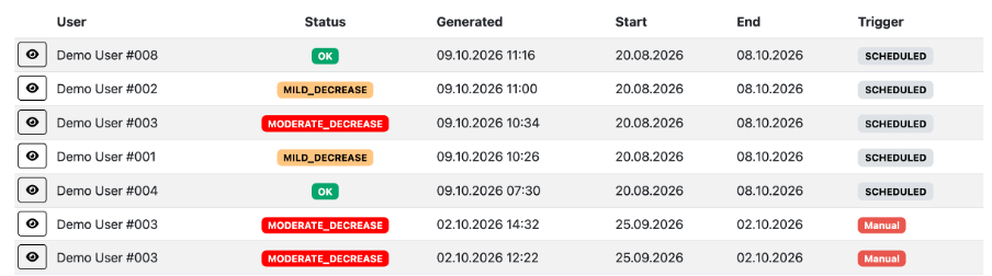
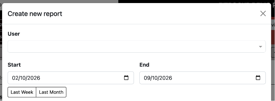
Incoming reports automatically appear on a scheduled basis, but there is also an option to generate a manual report for a user at a time-period of your choosing.
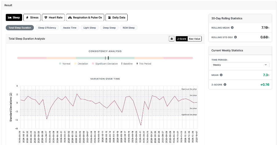
To explore these pattern detections in more detail, you can click into each triggered report using the ‘eye’ icon. This provides insight into specific pattern changes for each data stream across the reported time-period.
By clicking on a data stream, you can view the user’s rolling 30-day baseline, including the mean and estimated standard deviation. You can adjust the resolution at which you explore changes between daily and weekly views. The mean and Z-score* (level of deviation from the personalized baseline) for the selected day or week are displayed alongside a consistency analysis figure and Z-score line graph.
The consistency analysis provides a visual representation of how the mean value for the selected day of week has changed relative to the user’s rolling 30-day baseline. The Z-score table presents the values for each day within the selected time-period, with threshold lines indicating mild and moderate deviations. These are currently set at 1.5 and 3 standard deviations from the personalized baseline, respectively.
*Z-score: the number of standard deviations that the selected value differs from the user’s rolling 30-day baseline. Baseline variability is estimated using the Median Absolute Deviation (MAD), providing a robust estimate of standard deviation that is less sensitive to outliers.
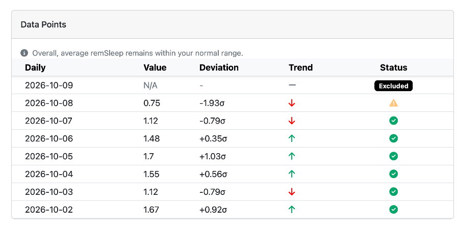
You can also scroll down the page to see information on the specific data points. This offers a traffic light system, whereby a green tick in status reflects no deviation outside the typical range, orange reflects mild deviation, and red reflects moderate deviation. You can use this table to identify specific days of interest.